.avif)
.avif)
.avif)
.avif)
.avif)
.avif)
.avif)
.avif)
Sixteen facilities, one identity.
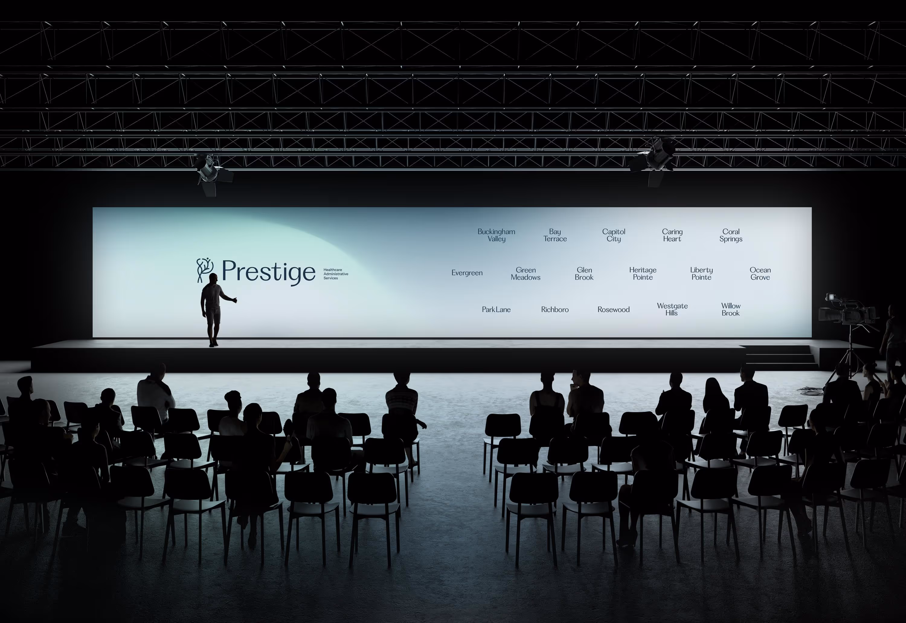
Prestige Healthcare Administrative Services operates 16 nursing and rehabilitation centers across the East Coast. Known for clinical excellence and compassionate care, Prestige reached a pivotal moment: their identity no longer reflected the innovation, unity, and premium care they deliver daily. Our team partnered with Prestige to create a full rebrand, from strategy to execution, that would unify their facilities under one modern, human-centered visual language.
The Challenge
The organization faced a fragmented brand presence. Each facility had its own look and feel, often outdated and inconsistent with the standards of care Prestige provides. This created confusion for patients, families, and partners, diluting trust and recognition. Prestige needed a comprehensive identity system that could:
The Solution
We approached this as a complete rebrand, starting with deep research into Prestige’s values, culture, and competitive landscape. The new identity centers on the concept of the “Science of Attention”, balancing clinical excellence with human connection.
Highlights of the solution include:

The Brand
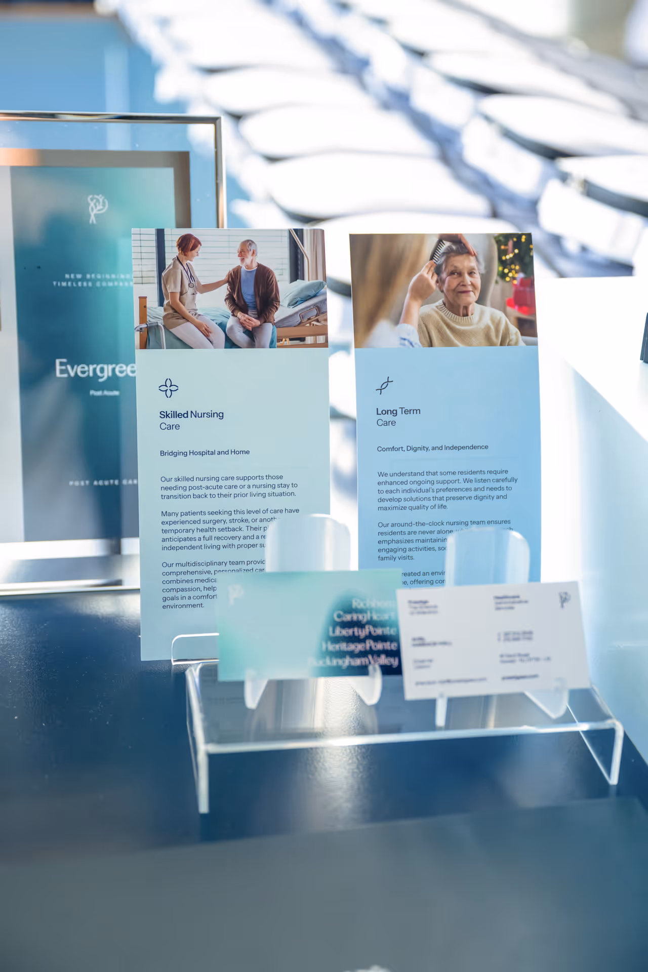
The Prestige brand was reimagined to communicate both trust and modernity. At its core is the belief that healthcare should combine clinical excellence with genuine compassion. The new identity was designed to unify all 16 facilities under one visual language, while still leaving room for each location to feel welcoming and personal.
By focusing on clarity, empathy, and professionalism, the refreshed brand ensures that every interaction, from digital experiences to in-facility signage, reflects Prestige’s promise of consistent, high-quality care.
The Prestige wordmark was carefully refined to align with the new symbol. The typography was modernized by removing serifs and softening edges, creating a look that feels elegant, approachable, and highly legible. Together with the “P” mark, the logo forms a strong and unified identity that balances professionalism with compassion.

This placeholder text serves as an example of how to structure your brand guidelines. Replace all content with your own copy before publishing.
.avif)
.avif)
PP Fragment is a modern serif typeface that balances classical proportions with a contemporary edge. Its sharp serifs and generous curves make it well suited for editorial design, branding, and bold statements.
Instrument Sans is our primary sans-serif typeface, chosen for its clarity and versatility. Its modern geometric shapes and balanced proportions make it highly legible across digital and print applications.
Our brand identity is built on a spectrum of blues that anchor the design system with confidence and consistency. The deep navy establishes strength and authority, serving as the foundation for backgrounds, typography, and key brand moments.Lighter blues expand the palette with clarity and approachability, creating space for calm, openness, and trust. Used together, these tones form a cohesive visual language that feels modern, steady, and assured.
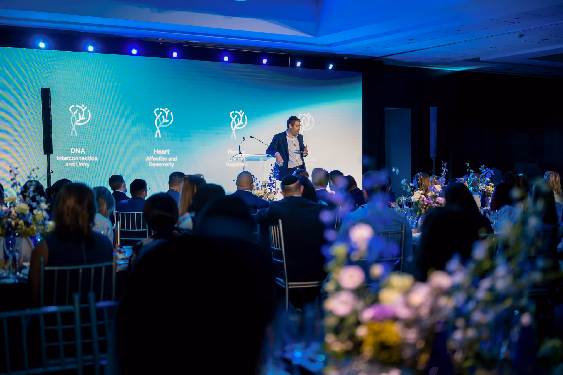
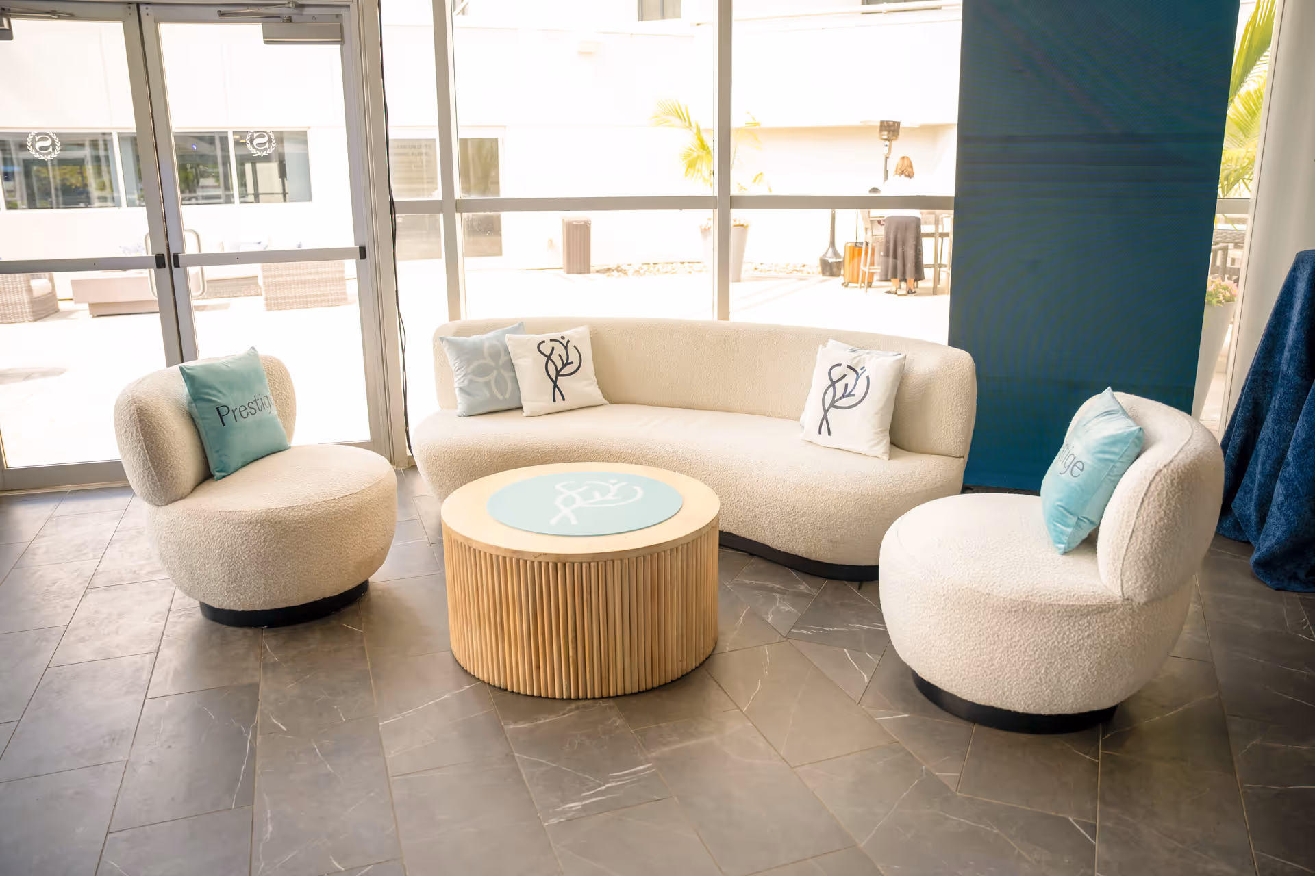
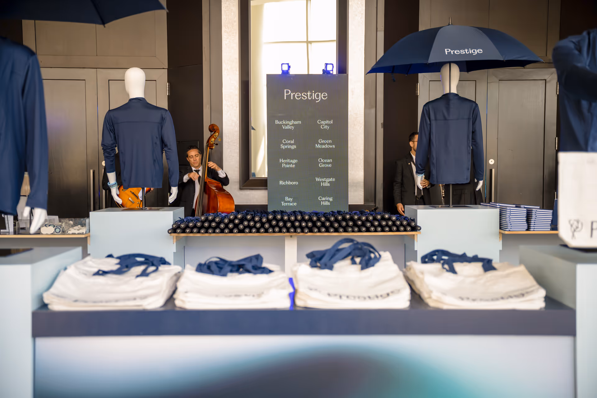
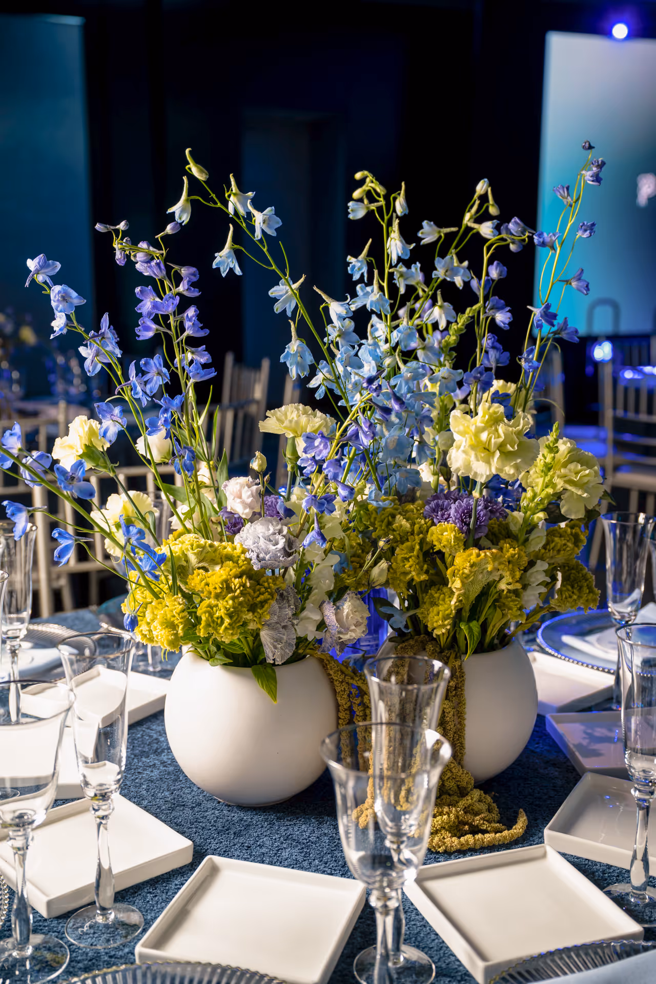
Our brand launch was more than an introduction. It was a celebration of the people who bring our mission to life every day. Representatives from each facility came together for an event that honored their dedication and showcased the future of Prestige.


.avif)


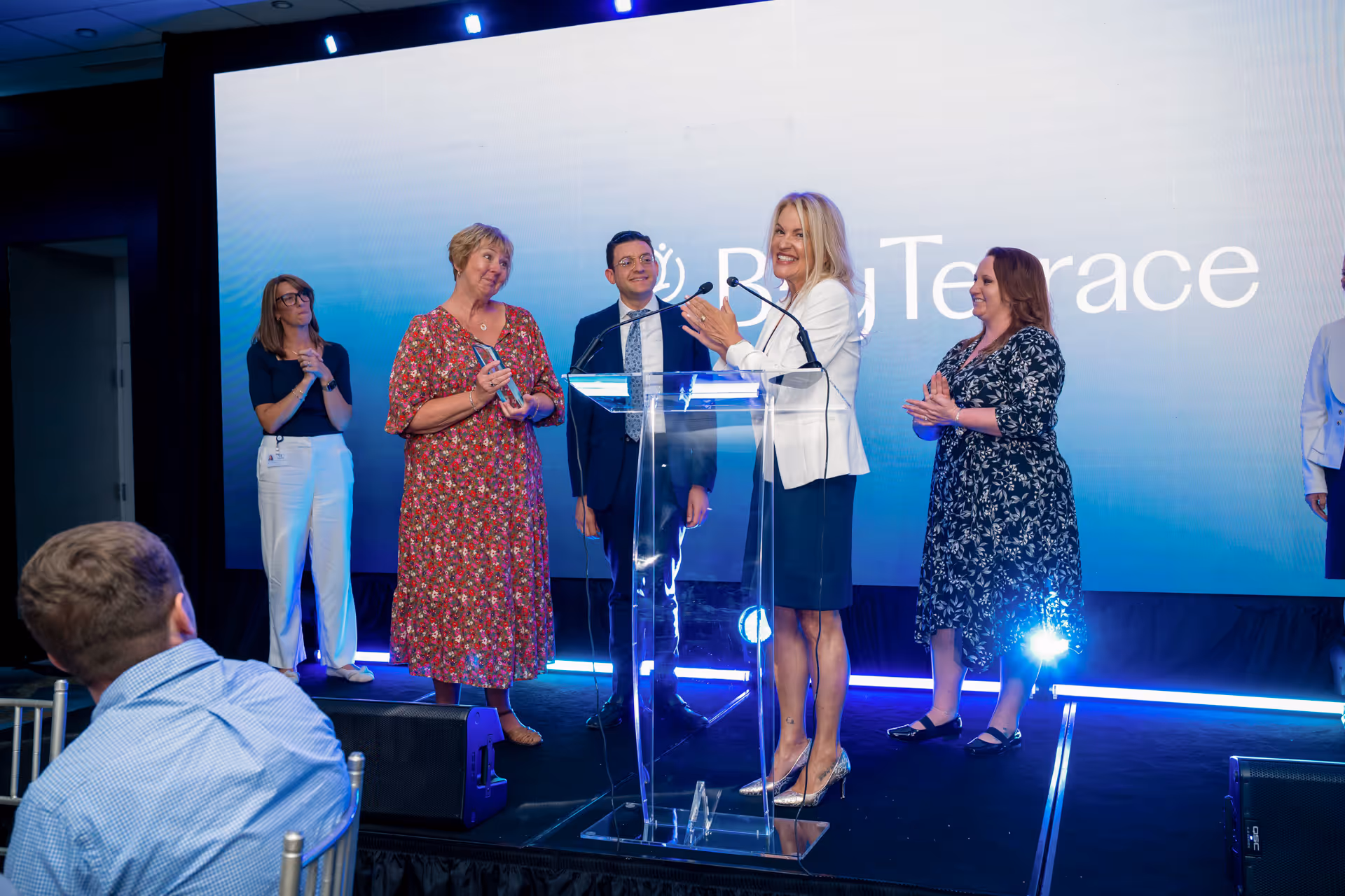


A highlight of the evening was the presentation of awards, each custom designed to represent the Prestige brand and crafted specifically for this occasion. These awards recognized administrators for their leadership, their impact on their teams, and the trust they build with patients and families. By shining a spotlight on their achievements, the event reinforced the belief that our people are at the core of Prestige’s strength.
The program also featured a motivational keynote speaker, who delivered a message of resilience, teamwork, and growth. Their words energized the room and reminded everyone that Prestige’s new identity is not only about how we look, but also about how we lead, how we care, and how we continue to grow together as one organization.
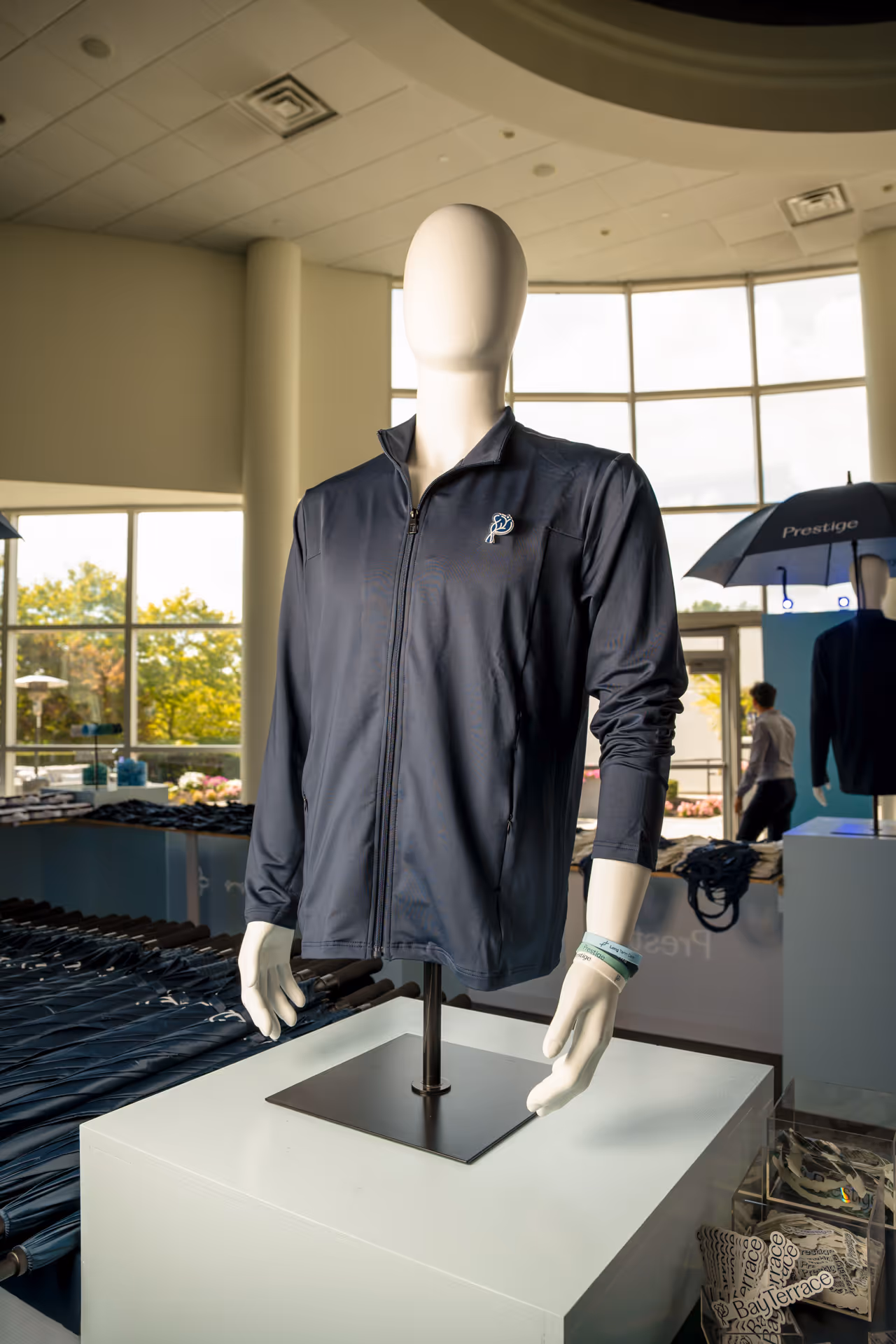
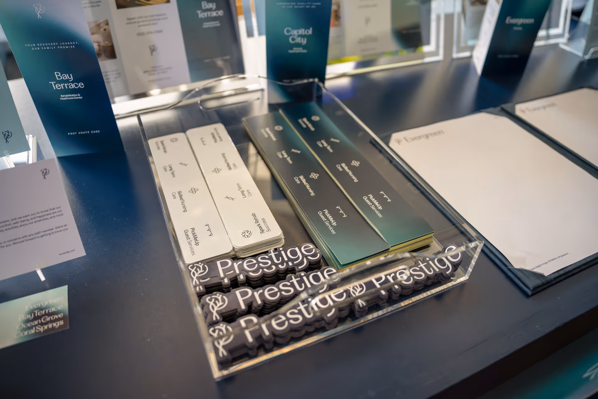
To make the brand tangible, we introduced a collection of Prestige merchandise created for every facility. Jackets, pickleball paddles, pens, and other branded items were designed as both practical tools and symbols of pride. Each piece carried the new identity, allowing staff and administrators to take part in bringing the brand into their daily work and community.
The reveal was more than a design rollout. It was about building momentum, creating a sense of belonging, and fostering community across all 16 facilities. Most importantly, it marked a new chapter for Prestige, one that balances clinical excellence with human connection and positions us with confidence for the future.
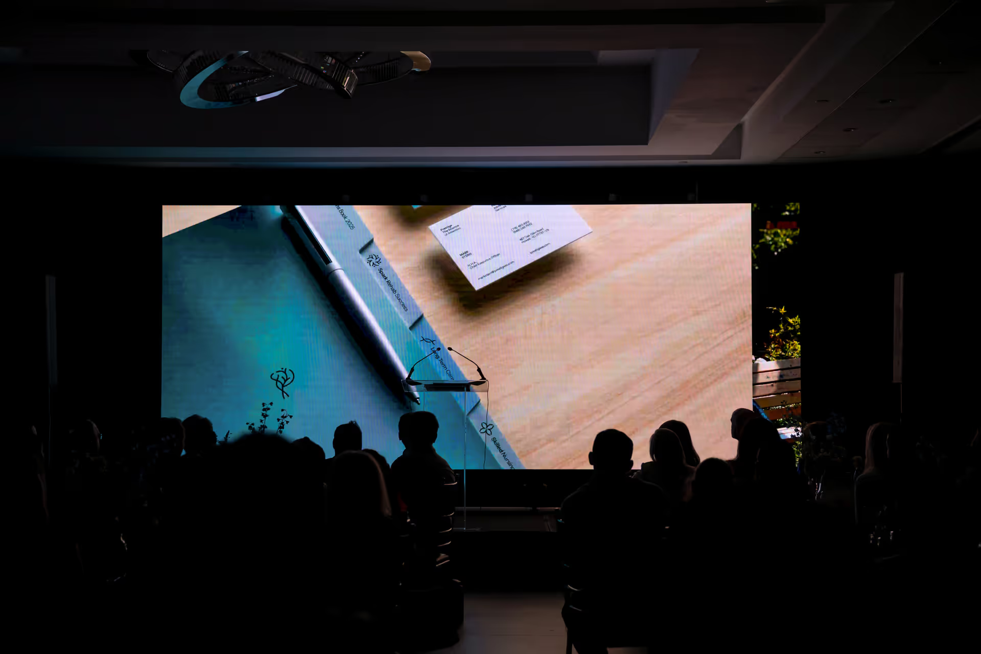
As the centerpiece of the event, we premiered the new Prestige brand video on a large screen before a full audience of facility representatives and partners. The lights dimmed, and the room quieted as the film began, creating a moment of anticipation and focus.
As part of the rebrand, we launched 16 new websites, giving every Prestige facility a modern, unified digital presence. Each site shares the same brand system while highlighting the unique character of its community.This rollout created consistency across the network, improved access to information for patients and families, and strengthened Prestige’s presence online. Explore each facility’s site below.
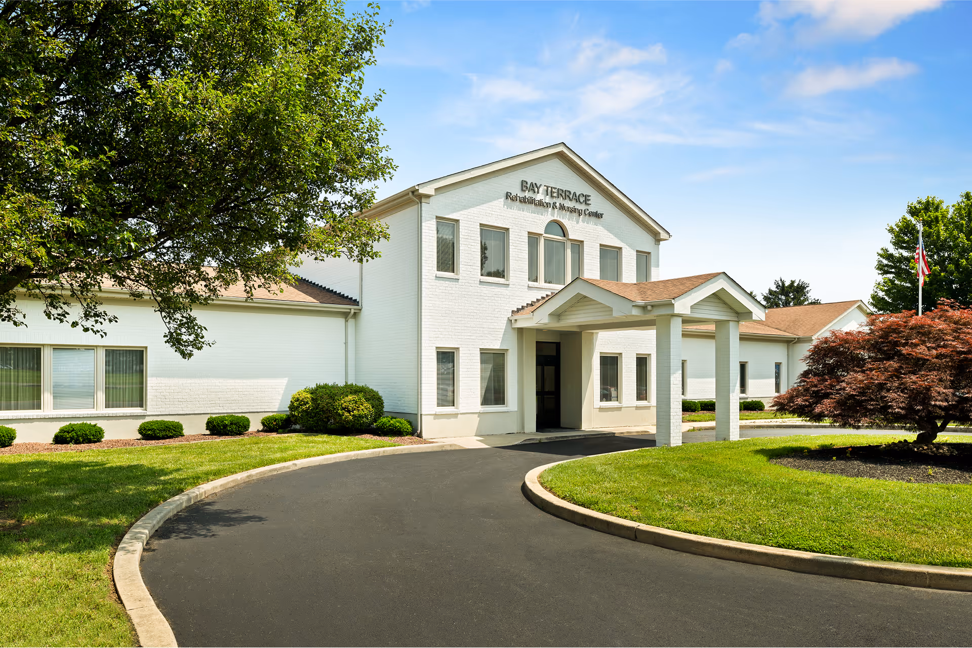
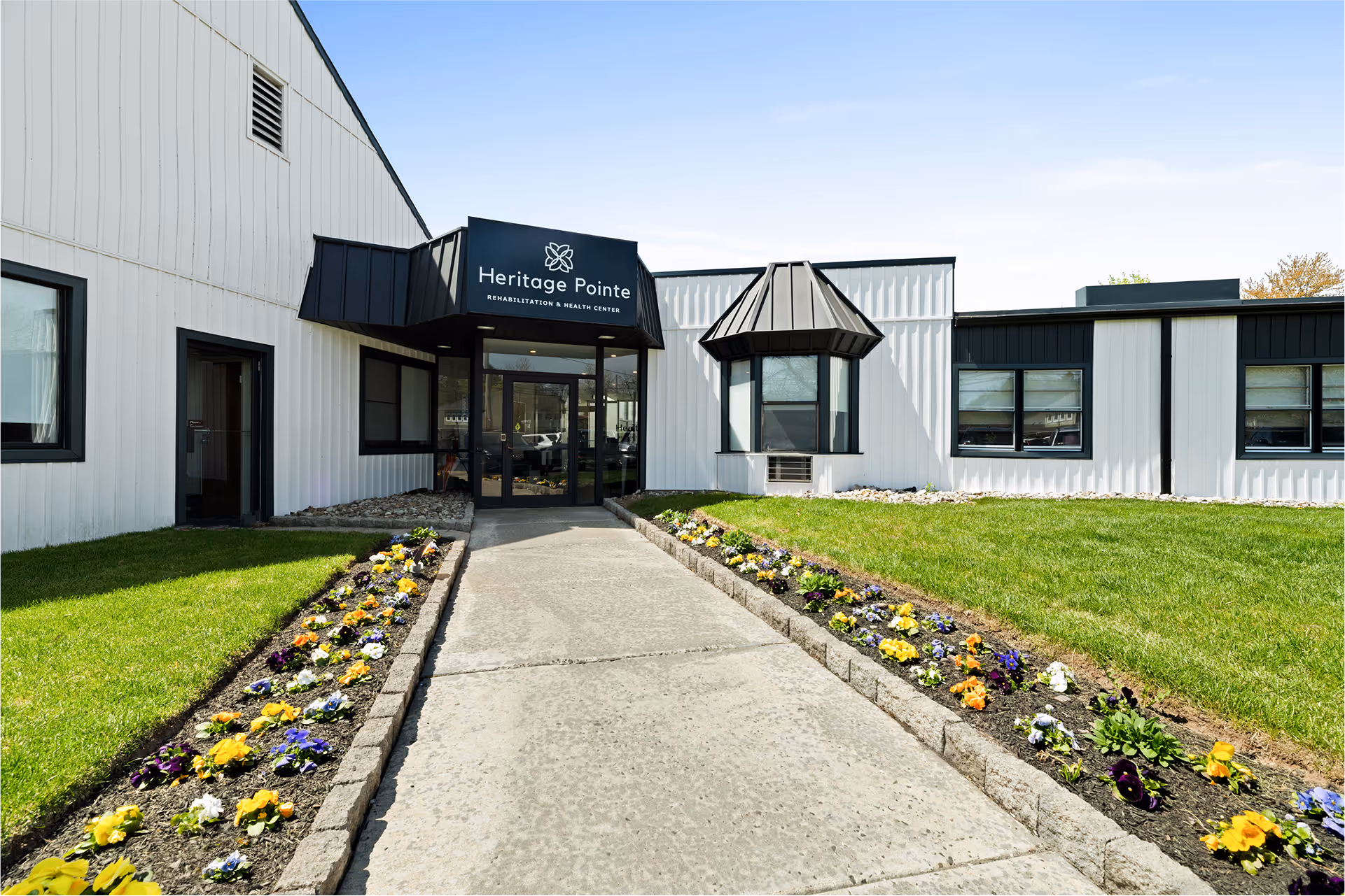
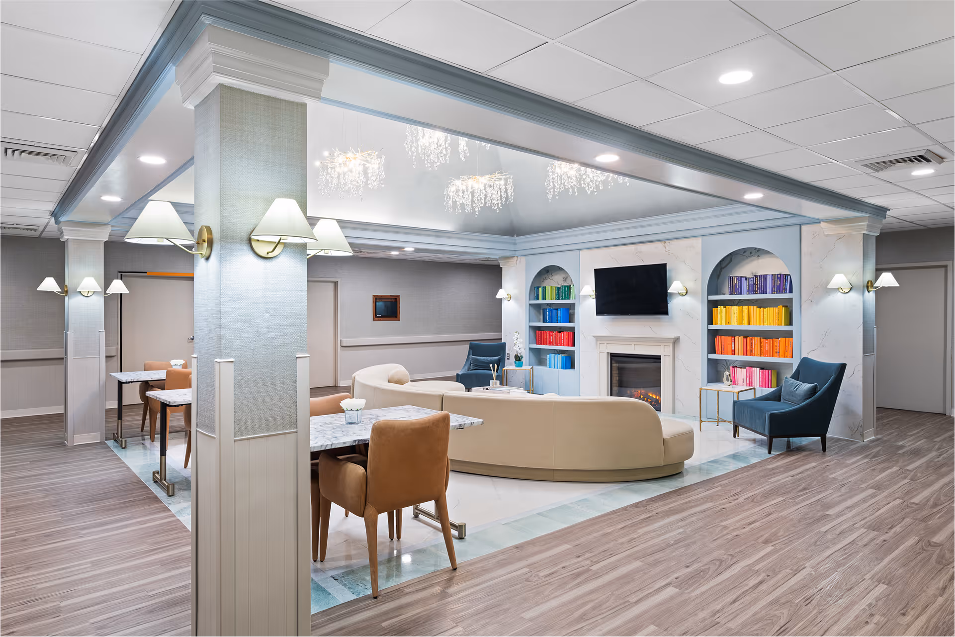
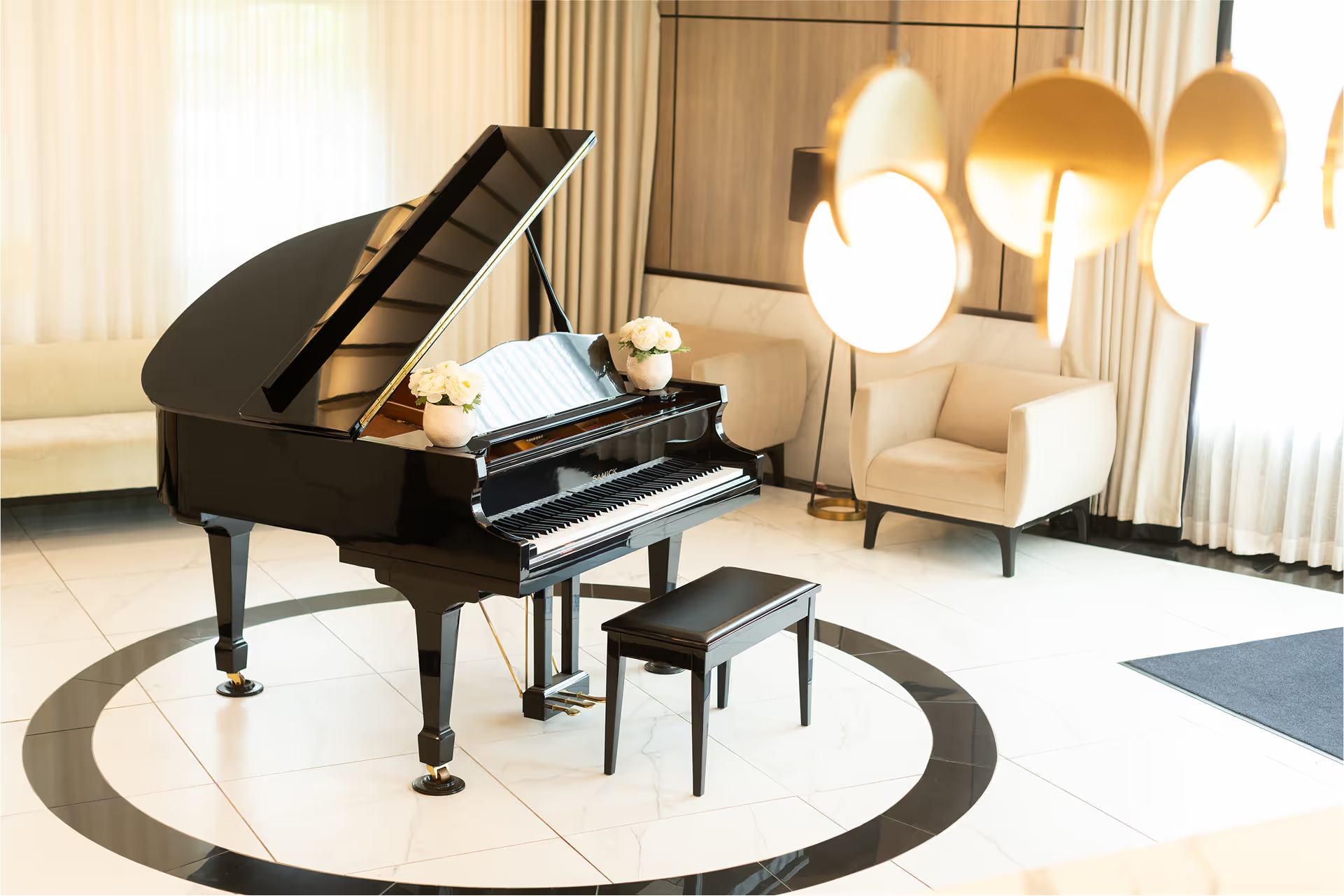
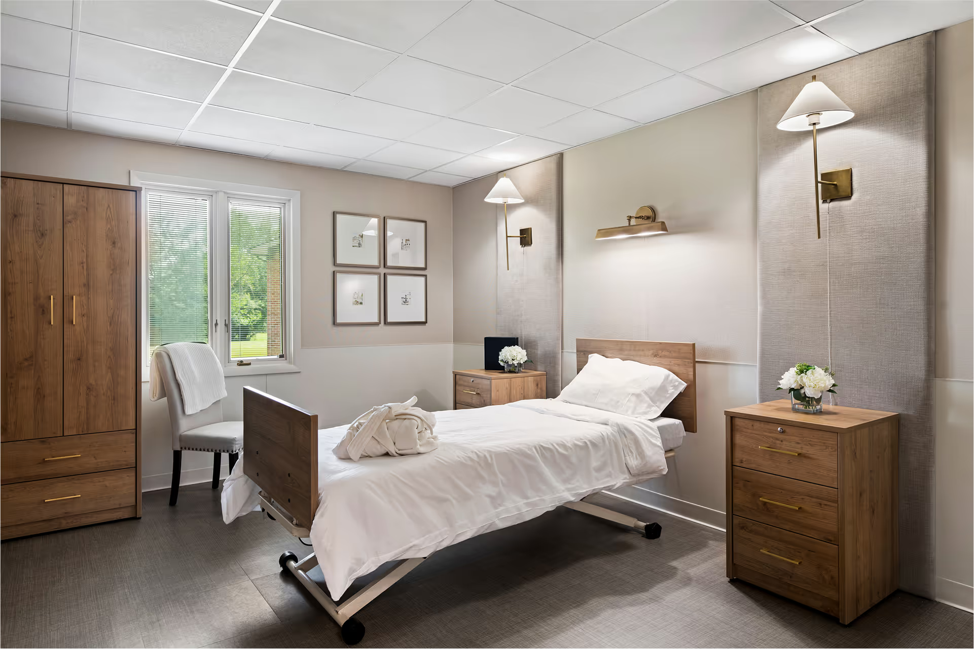
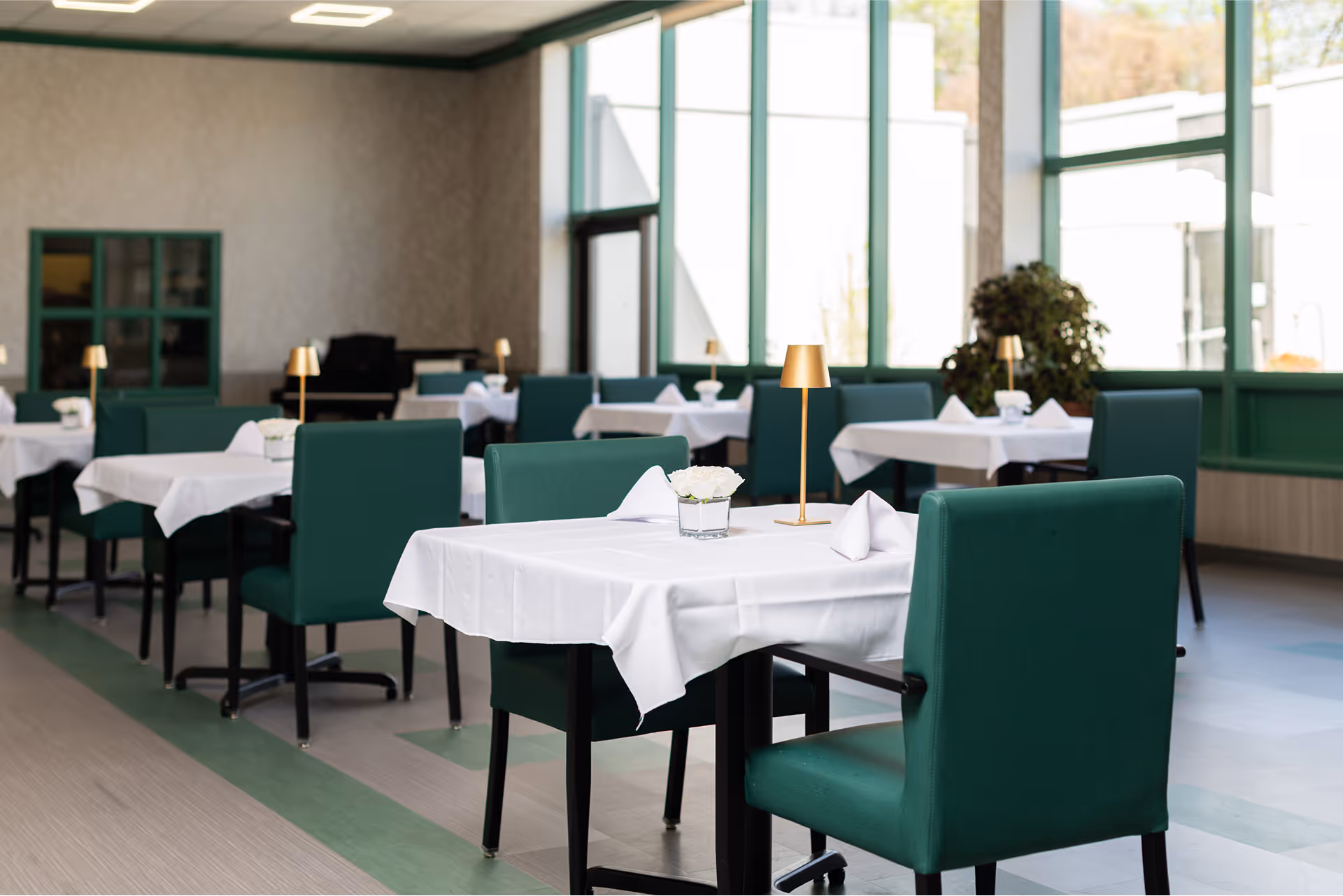
As part of the rebrand, we organized and directed new photoshoots at every Prestige facility. Each session captured authentic moments with staff, residents, and environments to reflect the compassion and professionalism at the heart of Prestige.The imagery was designed to serve multiple purposes across both print and digital platforms, creating a cohesive visual library for marketing, websites, and community outreach. By investing in original photography, every facility now has visuals that feel genuine, consistent, and aligned with the new brand identity.